Data Science Tutorials
Below are a few examples of my data science tutorials.
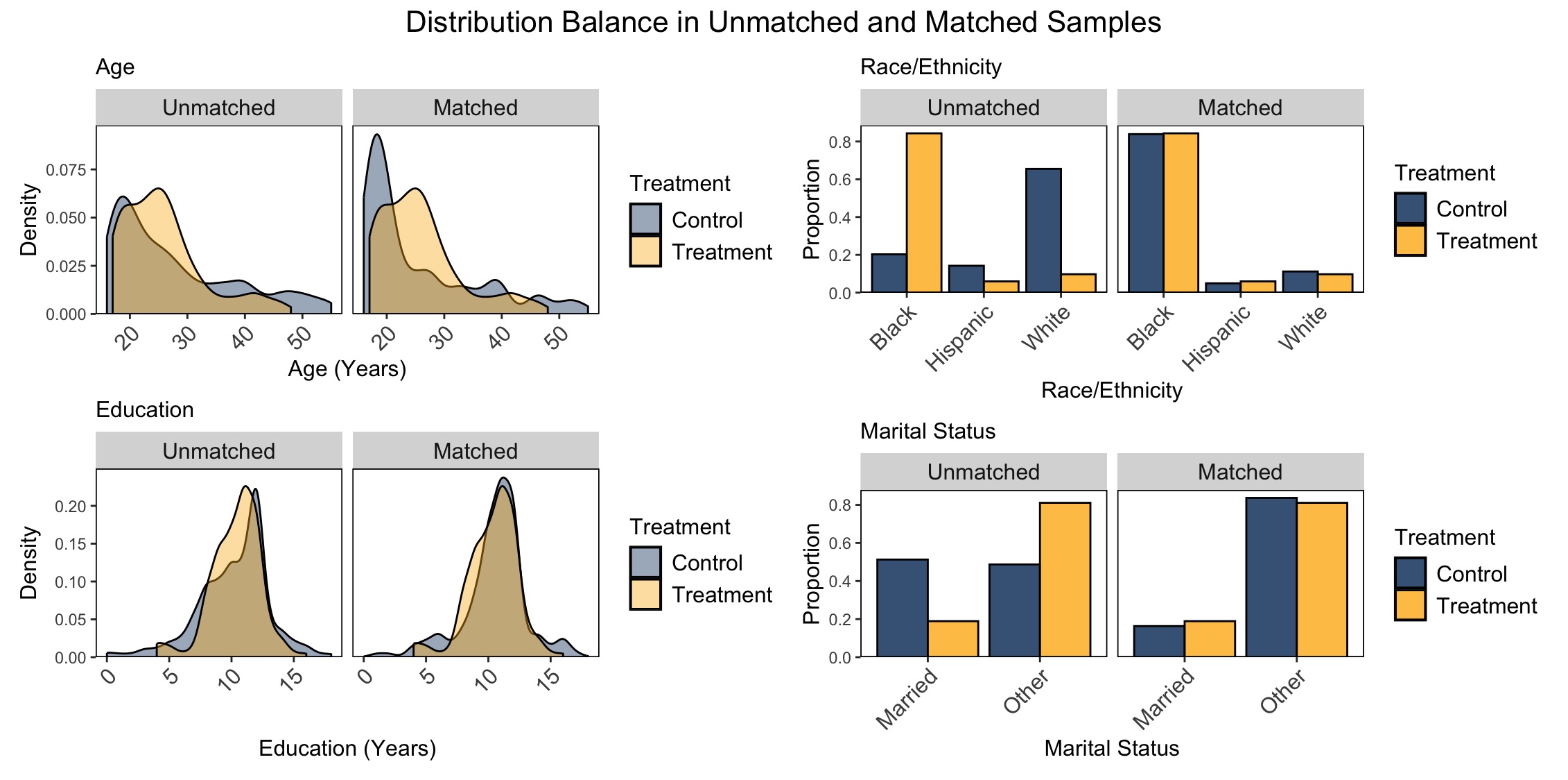
Propensity Score Matching for Causal Inference: Creating Data Visualizations to Assess Covariate Balance in R
Although some people consider randomized experiments the gold standard, in many cases, it would be highly unethical to assign individuals to harmful exposures to measure their effects. Modern causal inference techniques help scientists to estimate treatment effects using observational data. In particular, propensity score matching helps scientists estimate causal effects using observational data by matching individuals so that the “treatment” and “control” groups are balanced on measured covariates. After implementing propensity score matching, data visualizations make it easier to assess the quality of the matches before estimating effects. This blog post is a tutorial for implementing propensity score matching and creating data visualizations to assess covariate balance–that is, visually assessing whether the matched individuals are balanced with respect to measured covariates.
The R code can be found in this GitHub repository.
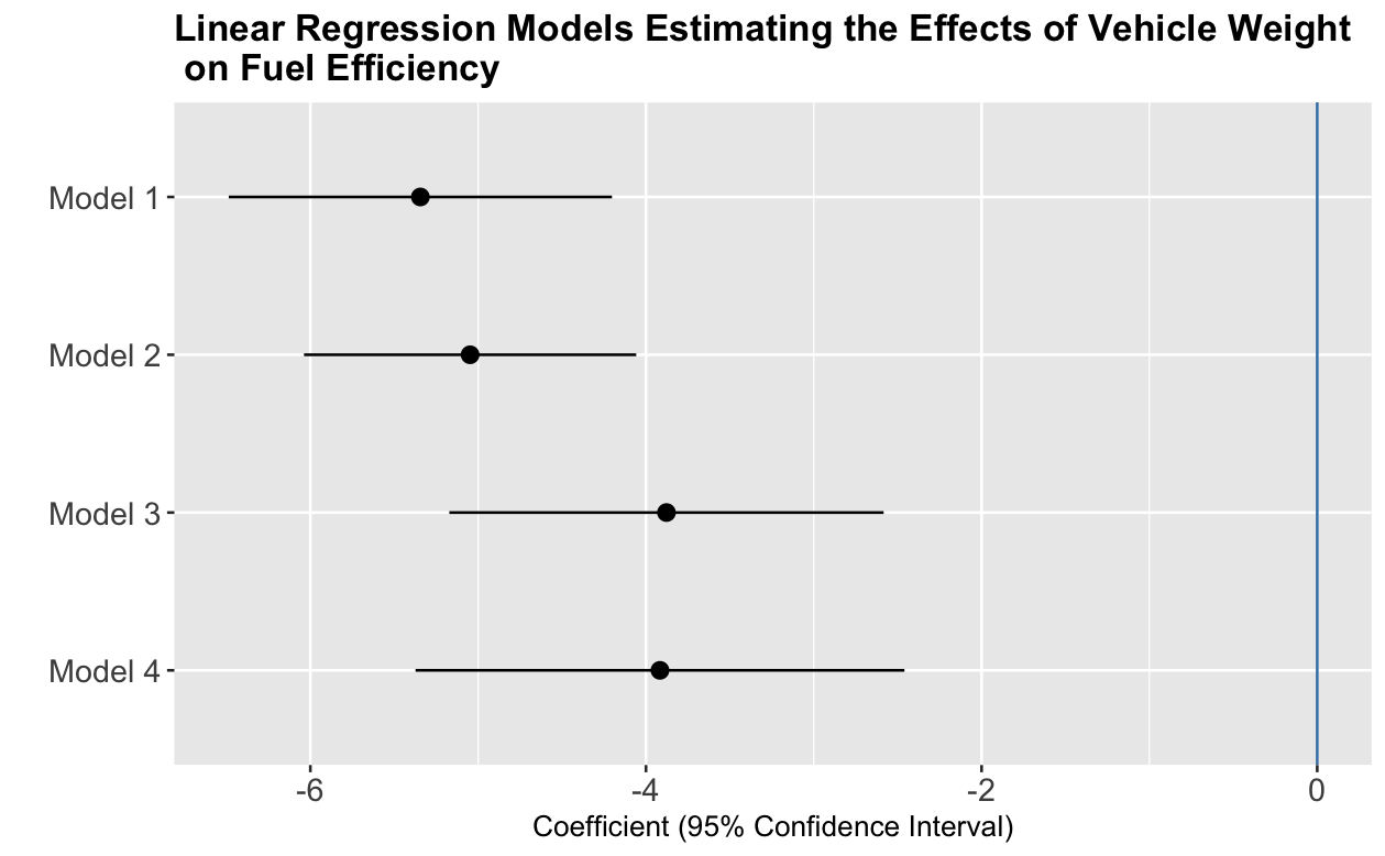
Using Forest Plots to Report Regression Estimates: A Useful Data Visualization Technique
Regression models help us understand relationships between two or more variables. In many cases, results are summarized in tables that present coefficients, standard errors, and p-values. Reading these can be a slog. Figures such as forest plots can help us communicate results more effectively and may lead to a better understanding of the data. This blog post is a tutorial on two different approaches to creating high-quality and reproducible forest plots, one using ggplot2 and one using the forestplot package.
The R code can be found in this GitHub repository.